Retro is one design style I love for its bold patterns and bright flair which takes my imagination backward to the epoch of 30’s, when the fashion savvy genre of people wore huge prints with not much elaboration. More than any other reason, for me it is one comfort style, when mixed and matched up with solids could become a little less casual and when used as a whole, springs up a feeling of fun and frolic.
ORIGIN OF RETRO
The word ‘Retro’ comes from Latin prefix ‘retro’ which means ‘a fashion reminiscent of the past’, and ‘retrospective’, referring to ‘a nostalgic insight towards the past’. Culturally aged trends from the post modern past symbolize the popular design element of Retro.
It speaks of a cynical resurgence of older but relatively recent fashions. Some refer to it as timeless and classic, but mostly it portrays designs and patterns from the past that no longer seem modern. Some say it takes us back to the era of fifties, but many say it belongs to the period of thirties.
Retro Fashion may consist of fashion products that picked magnitude during the 50’s and 60’s and the style now called “retro art” is a species of pop art which came into existence sometime in 50’s and 60’s with bold, eye catching patterned graphics that were easy to generate and also to create impact.
RETRO DESIGNS
Retro designs describe facets of modern culture which are a conscious derivative of those style and trends of the recent past which had come to be seen as unfashionable. The mood in these designs is usually playful and ironic and the classics created with such patterns have a superfluous emotional punch, and a completely distinctive realm. These nostalgic designs arouse feelings and better manage to evolve more and more number of designers and users as it can look cool and offer a lot more unexpected.
With robust and dynamic elements in design, Retro is becoming increasingly popular these days in a variety of contexts as these creative and appealing patterns never turn unexciting, rather stand out and look really different. Below are some examples of the same.
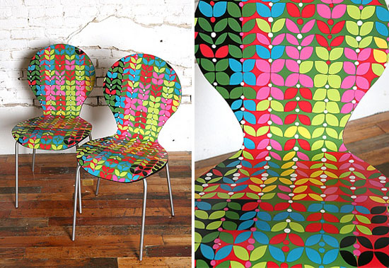
 Retro Print - Picture by www.byhand.me
 Retro Prints- Picture by www.janefosterblog.blogspot.com
Retro colors play a terrific role in producing an older and nostalgic stroke to designs. They can accentuate any design with something relatively different from the modern point of view of design. Colors play a very significant role in creating a look of a long gone epoch. In the most successful retro designs, an appropriate color palette acts in amalgamation with the other elements to give the feel of a retro design. With colors, a designer could hint that these colors may have been more vibrant in the past but with time they have lost their vibrancy and are now old. Mostly designers use muted colors to induce age in their designs.
The best thing I like about Retro colors and designs is that it generates an irrefutable sense of class and uniqueness, something that can be well linked with the gone by times and not seen as frequently these days. To add to this, it produces a feel of acquaintance and comfort level that can be exciting and hospitable.
Retro colors induce a deep nostalgic remembrance of simpler times that the present society has lived. The feeling is priceless and every designer has at least a decade worth of reference to draw inspiration from. We can merge these bygone elements with some fresh colors to use in present, however, the overall theme or design story and mood should be zeroed to one precise type of retro art.
Retro color palettes are generally limited. I think the reason behind it to keep it simple and moreover it also indicates lack of colors obtainable for printing in the past. In fact one can create something really remarkable in retro style of designs by employing a old looking texture that gives an impression and appearance of ‘worn out’. Worn out textures or wrinkled surfaces in the background can also create a retro look that can be instantly acknowledged as Retro.
These days Retro brings with it an essence of folklore that is both nostalgic and fresh. Nostalgic because it is old fashioned and fresh because it is being used at present. Hence a suitable color palette is essential to bring forth a feel of a specific era.
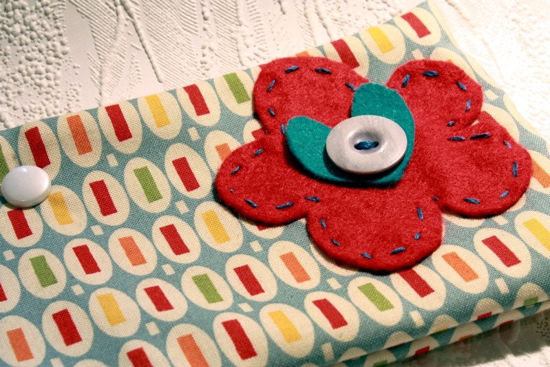
In my retro Gallery, I have tried to combine the old fashion patterns and colors with the taste of new. The colors are strictly old in most of them but to keep pace with the current trends I have tried to use some trendy colors too. The result is graceful. I have tried to play with some real retro colors to bring the feeling alive. Below are some examples of retro colors.


No comments:
Post a Comment